Did you know that over 80% of guests remember a wedding’s visual theme the most? Choosing a wedding color palette early makes planning fun and exciting. It sets the tone for all your design choices.
This theme guides your choices from flowers to table settings. Picking your look early makes planning easier and ensures your event feels special.
Every detail will fit perfectly, making your day look effortless and polished.
Choosing your colors now saves time and avoids decision fatigue later. A great wedding color palette is the heart of your decor. It brings your style together beautifully. Let’s make your dream wedding a reality.
Key Takeaways
- Visual harmony significantly enhances the guest experience.
- A central theme simplifies future design decisions.
- Start your planning by defining your core aesthetic.
- Consistency across decor creates an intentional atmosphere.
- Early planning reduces stress and prevents decision fatigue.
Understanding the Basics of Your Wedding Color Palette
Choosing the right colors is more than just picking a theme. It’s the heart of your wedding. By picking a wedding color scheme early, you make sure everything fits together perfectly. This step helps tell your unique love story through colors.

Defining Your Wedding Vision
To create a meaningful atmosphere, start by turning your style into a plan. Think about the feelings you want your guests to have when they arrive. Whether it’s a romantic garden or a modern gala, your colors will set the mood.
Begin by collecting ideas that match your personality. A certain wedding color scheme can help you pick out invitations, linens, and flowers. When you know what you want, making choices is fun and easy.
The Psychology of Color in Celebrations
Colors can change the mood of your event. Soft pastels can feel calm and romantic, while bright colors can make things lively. Knowing this helps you create the right atmosphere.
Think about how colors work with your venue’s lighting and design. A good wedding color scheme does more than look good. It shapes your guests’ experience from start to finish. By mixing your favorite colors with their effects, you make a space that feels real and welcoming.
Assessing Your Wedding Venue and Season
Choosing the best wedding colors is a mix of your taste and the venue’s natural beauty. Your venue is like a canvas for your big day. It’s important to think about how your colors will look against the backdrop.

Matching Colors to Seasonal Landscapes
Nature sets the mood for your event. For a fall wedding, think about warm, earthy tones like burnt orange and deep gold. These colors match the changing leaves.
In spring, soft pastels are perfect. They reflect the new blooms and create a sense of harmony.
Working with Existing Venue Decor
Before picking your colors, look at your venue’s features. Things like carpeting and walls can affect your color choice.
If your venue has bold colors, choose neutral accents. This way, your decorations won’t clash with the room.
Indoor vs. Outdoor Considerations
Indoor venues need bold colors to stand out under artificial light. Outdoor spaces look best with lighter colors that shine in sunlight.
| Season | Primary Palette | Accent Color | Best Venue Type |
|---|---|---|---|
| Spring | Blush, Sage, Cream | Gold | Garden or Greenhouse |
| Summer | Coral, Sky Blue, White | Silver | Beach or Vineyard |
| Autumn | Burgundy, Mustard, Navy | Copper | Rustic Barn or Lodge |
| Winter | Emerald, Gold, Deep Red | Champagne | Historic Ballroom |
The best wedding colors are those that feel true to you and match your venue. Visit your venue during your wedding season to see how the light affects it.
Finding Inspiration for Your Color Scheme
Exploring creative sources can turn your dream wedding colors into reality. This step helps you decide what you like before making a choice. It keeps your planning organized and focused on your special day.
Utilizing Digital Mood Boards
Digital tools are great for saving your favorite wedding color ideas. Sites like Pinterest or apps like Canva let you save images and patterns. Create a board to see how colors work together.
Look for a common mood in your saved images. If most are soft or bold, you’re finding your style. This makes sharing your vision with vendors easier.
Drawing from Personal Interests and Memories
Your wedding colors might come from your life. Think of your favorite places, hobbies, or childhood memories. These add a personal touch, making your wedding special and meaningful.
“The most beautiful weddings are those that reflect the genuine personality and history of the couple.”
Here’s a table to help organize your inspiration:
| Source Type | Inspiration Focus | Benefit |
|---|---|---|
| Digital Boards | Visual Trends | High Organization |
| Travel Photos | Natural Palettes | Unique Aesthetic |
| Personal Hobbies | Emotional Connection | Deeply Meaningful |
| Art & Design | Color Theory | Professional Balance |
Mixing digital tools with personal memories will help you find the right wedding color inspiration. Stay open to new ideas but keep what feels most like you. Your final color scheme will show your love story beautifully.
Applying Color Theory to Your Wedding Design
Choosing the best wedding colors is more than just picking your favorite shades. By applying basic color theory, you can create a professional look. This look will feel balanced and sophisticated throughout your entire event.
This approach helps you make confident decisions for everything from floral arrangements to table linens. Mastering these principles ensures your wedding design feels intentional and visually stunning.
Understanding the Color Wheel
The color wheel is your most valuable tool for visual planning. It displays the relationships between primary, secondary, and tertiary colors in a clear, circular format.
By looking at how these hues sit across from or next to each other, you can identify which tones naturally belong together. Understanding this layout allows you to move beyond guesswork and start designing with purpose.
Creating Harmonious Color Combinations for Weddings
When you want to build color combinations for weddings that truly pop, focus on the distance between colors on the wheel. Colors that are spaced out create high energy, while those close together offer a softer, more serene vibe.
You should aim for a mix that reflects the mood you want to set for your guests. Whether you prefer bold contrasts or gentle transitions, the wheel provides the perfect roadmap for your choices.
Complementary vs. Analogous Schemes
Complementary schemes use colors directly opposite each other on the wheel, such as blue and orange. These color combinations for weddings provide a high-contrast, vibrant look that feels modern and exciting.
Alternatively, analogous schemes use colors that sit side-by-side, like blue, blue-green, and green. This method creates a harmonious and calming effect that is perfect for elegant, understated celebrations.
Both methods are excellent ways to select the best wedding colors for your big day. Experimenting with these two styles will help you find the perfect balance for your unique aesthetic.
Step-by-Step Guide to Selecting Your Primary and Secondary Colors
Creating your dream wedding color palette is easier when you break it down. Follow a structured path to ensure your design feels cohesive. This approach helps avoid mistakes and keeps your vision clear.
Choosing Your Anchor Color
Your anchor color is the foundation of your design. It’s the color guests notice most, in big elements like bridesmaid dresses. Choose a color that reflects your style and mood.
Whether it’s a bold navy, a soft blush, or a classic emerald, pick a color you love. This anchor will guide all your design decisions.
Selecting Supporting Shades
After choosing your anchor, add supporting shades to your wedding color palette. These colors should complement your anchor without overpowering it. Think of them as the supporting cast that enhances your main color.
You might choose a lighter tint of your anchor or a complementary shade. These additions bring balance and harmony to your decor. They connect your main color to the venue’s neutral elements.
Adding an Accent Color for Depth
To make your design pop, add a vibrant accent color. This color adds depth and draws the eye to focal points. Use it sparingly in items like invitations and boutonnieres for a striking visual impact.
A well-chosen accent color adds sophistication to your wedding color palette. It turns a simple scheme into a polished look. Here’s a breakdown to help organize your selections:
| Color Role | Primary Function | Common Usage |
|---|---|---|
| Anchor Color | Sets the mood | Linens, Bridesmaid Dresses |
| Supporting Shade | Adds harmony | Floral filler, Stationery |
| Accent Color | Creates focal points | Boutonnieres, Cake details |
Incorporating Metallics and Neutrals for Balance
Neutral tones and metallic finishes are key to a polished wedding look. When looking for wedding color inspiration, don’t just focus on bold colors. These subtle elements help your design stand out.
The Role of Neutrals in Your Palette
Neutrals are the foundation of your look. Shades like ivory, taupe, or soft gray keep your colors balanced. These tones let your theme shine without feeling too busy.
Choosing a neutral base is a smart wedding color idea. It creates a sophisticated feel. Whether it’s white or beige, it lets your bright colors pop.
Selecting the Right Metallic Accents
After setting your base, add metallic touches for luxury. The right metal can change your venue’s mood. Here are some top picks:
- Gold: Adds a classic, romantic feel to evening events.
- Silver: Great for modern or winter themes.
- Copper: Perfect for rustic or bohemian styles.
Using metallics well means using them sparingly. You don’t need to cover everything in shine. Instead, highlight key areas like table settings or stationery. This approach adds timeless elegance that impresses your guests.
Testing Your Color Combinations for Weddings
Bringing your dream palette to life is more than just digital inspiration. Mood boards are great for starting, but you need to see if your color combinations for weddings work in real life. This step makes sure your vision looks as good in real life as it does on your screen.
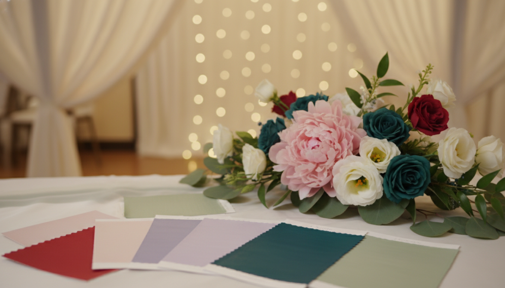
Creating Physical Swatches
Begin by getting physical samples of your colors. Go to local fabric stores or order swatches from vendors. See how different materials look in light. Texture is key because it changes how a color looks, like velvet, silk, and linen.
Put these swatches next to each other to check if they match. If one color doesn’t fit, change it before you order. This way, you avoid mistakes and feel confident in your choices.
“Color is a power which directly influences the soul.”
Visualizing Colors in Different Lighting
Lighting changes how colors look, so test them in different places. Take swatches outside for natural light, which shows true colors. Then, check them in dim light to see if they’re too dark.
Many venues have special lighting that changes the mood of your decor. By testing your color combinations for weddings in bright sun and dim light, you ensure a consistent look all day. Your goal is to create a balanced atmosphere that looks amazing from start to finish.
Coordinating Your Bridal Color Palette with Attire
Bringing your wedding color palette to life is more than just table linens and lighting. It also includes the attire of your bridal party and the beauty of your floral arrangements. This makes your wedding look professional and polished.
When everything matches, your wedding feels intentional and sophisticated. This consistency makes your photos stunning and leaves a lasting impression on your guests.
Matching Bridesmaid Dresses to Your Theme
Your bridesmaids are key to your wedding’s visual impact. Choosing dresses that match your bridal color palette makes your wedding party look like a cohesive part of the design. It’s not just an afterthought.
“Color is a power which directly influences the soul.” — Wassily Kandinsky
Think about the texture and fabric of the dresses to add depth to your colors. You could go for a monochromatic look with different shades of one color. Or mix complementary tones for a modern, dynamic look.
| Theme Style | Dress Fabric | Color Strategy |
|---|---|---|
| Romantic/Garden | Chiffon or Tulle | Soft Pastels |
| Modern/Chic | Satin or Silk | Bold Jewel Tones |
| Rustic/Boho | Velvet or Lace | Earthy Neutrals |
Integrating Colors into Floral Arrangements
Flowers connect your attire and venue decor. By picking blooms that match your bridal color palette, your bouquets and centerpieces will feel like a natural part of your theme.
Work with your florist to find seasonal flowers that match your colors. Consistency is key to avoid a cluttered or mismatched look in your arrangements.
Remember, greenery can balance your wedding color palette. Using foliage effectively lets your main colors stand out. This creates a vibrant and balanced display in your ceremony and reception spaces.
Managing Your Wedding Color Trends and Personal Style
Finding the right mix of modern style and timeless elegance is key to a memorable wedding. With so much inspiration online, it’s easy to get lost. But, staying focused helps you make choices you’ll love for years to come.
It’s tempting to follow the latest trends, but your goal is to create a celebration that looks stunning in photos. By blending new influences with classic elements, your event will feel both current and sophisticated.
Balancing Timeless Elegance with Modern Trends
When looking at popular wedding colors, think about their lasting appeal. A bold, neon shade might be trendy now, but consider its look in your family album twenty years later. Use these bold colors in small details like napkins or floral accents, not as the main theme.
Start with a neutral base for your bridal color palette and add trendy colors as accents. This way, you can enjoy the latest styles without feeling dated. Remember, true elegance often comes from simplicity and restraint.
Staying True to Your Personal Aesthetic
Your wedding should reflect your true self, not just follow trends. If you feel pressured to use certain wedding color trends, pause and think if they really match your spirit. Choosing colors you love will make your wedding more authentic and joyful.
Being confident in your color choices is the best accessory for your bridal color palette. When you choose colors based on your own taste, you create a space where you feel at ease and celebrated. Trust your instincts to pick popular wedding colors that feel right for you.
| Design Element | Trend-Driven Approach | Timeless Approach |
|---|---|---|
| Primary Palette | High-contrast, bold shades | Soft neutrals and pastels |
| Floral Choices | Exotic, seasonal novelties | Classic roses and greenery |
| Longevity | High risk of feeling dated | Enduring, classic appeal |
| Personal Impact | Reflects current social media | Reflects individual personality |
Practical Tips for Budget-Friendly Color Planning
Smart planning lets you follow wedding color trends without breaking the bank. You don’t need a big budget for a beautiful wedding. By making smart choices, you can have a stylish and personal wedding.
Sourcing Affordable Decor in Your Chosen Hues
Finding decor that fits your vision without spending too much is simple. Look for items that can be used in different ways. Focusing on quality over quantity keeps your wedding looking great while saving money.
- Bulk Buying: Buy linens, candles, and flowers in bulk for better prices.
- DIY Projects: Make your own signs or centerpieces with items from craft stores.
- Repurposing: Use your ceremony decor for the reception to get more value.
Smart Planning with Our Budget Calculator
Good financial management is key to a successful wedding. Tracking your spending helps you focus on what’s most important. Our tool helps you manage your budget, keeping your wedding color trends in mind without financial stress.
Why You Should Check Our Budget Calculator on the Button Below
Using a planning tool brings clarity and peace of mind. It shows you where your money is going and where to splurge. Take control of your wedding finances today by clicking the button below to access our interactive calculator.
Common Mistakes to Avoid When Choosing Wedding Colors
Choosing the right wedding color scheme can be tricky. It’s easy to make mistakes that ruin the look of your big day. By avoiding these common errors, you can make sure your wedding looks elegant and polished.
Overcomplicating Your Palette
Many couples try to use too many colors. It’s tempting to include all the popular wedding colors you see online. But, this often makes your decor look messy.
A good design focuses on a few colors that work well together. This way, your decor stays clean and intentional.
To keep your design simple, follow these tips:
- Stick to three to four main colors.
- Use neutral tones to connect bold colors.
- Don’t add extra colors just to fill space.
Ignoring the Impact of Lighting
Choosing colors without thinking about lighting is a big mistake. The lighting in your venue can change how your wedding color scheme looks. A bright color might look different in a dimly lit room.
Always test your colors in the venue at the right time of day. This way, you won’t be surprised if your popular wedding colors don’t look right. Remember, careful planning makes your wedding look great in photos.
Conclusion
Choosing the right colors makes your wedding day special. It’s a chance to show who you are and set the mood for everyone. This journey lets you express your personality in a unique way.
Trust your instincts when picking colors. Your style is the best guide for a celebration that feels real and unforgettable. Every detail, from flowers to table linens, adds to the atmosphere you’re creating.
Enjoy the planning process. Finding a balance between your style and budget makes it stress-free. You have everything you need to create a beautiful event that tells your love story.
Begin planning with confidence today. Share your favorite colors with your partner to see if you’re on the same page. Your dream wedding is waiting, and it starts with the perfect colors.